- Loading...
A product may have good material and shape, but a weak label can make it feel ordinary. I have seen this small detail reduce perceived value fast.
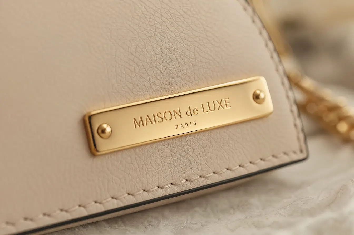
Custom real gold metal labels turn accessories into luxury symbols by combining precious finish, solid base metal, refined logo detail, and stable production quality. They help brands create a visible and touchable identity that feels premium from the first glance.
![]()
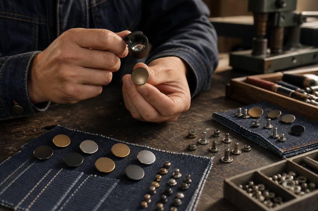
I used to see metal labels as simple branding parts. They were small plates attached to apparel, bags, shoes, packaging, or gifts. After working with many product teams, I started to understand them in a deeper way. A metal label is often the first touchpoint between the product and the customer. It can communicate trust in less than one second. It can tell the customer whether the product feels mass-market, premium, handmade, or collectible. When the label uses real gold plating, clean edges, and accurate logo work, it becomes more than a sign. It becomes a small luxury symbol. This is why I look at custom metal labels through material, plating, surface finish, logo detail, installation, and production consistency.
How Does a Small Hardware Detail Make a Product Feel More Expensive?
A small label can change the first impression of a product. If it feels weak, the whole product may feel weaker too.
A metal label makes a product feel more expensive when it adds weight, shine, clean edge quality, and clear brand identity. It works as a small visual anchor that helps customers trust the product faster.
I often see brands spend time on fabric, leather, packaging, and product shape, but they treat the label as a late detail. This can be a problem. The label is usually one of the first areas that customers notice. It may sit on the front of a handbag, the hem of a knitwear piece, the back of a cap, the corner of a gift box, or the surface of a limited product. It is small, but it carries a large part of the brand feeling.
A high-quality metal label gives the product a stronger visual center. It also creates a touchable point. When the customer touches the label, they feel the edge, weight, temperature, and surface. A plastic label may feel light. A thin metal label may feel weak. A real gold plated metal label can feel more refined when the base metal, plating, polishing, and edge treatment are done well.
| Label Detail | Premium Effect | Risk If Poorly Made |
|---|---|---|
| Metal weight | Adds solid and valuable feeling | May feel cheap if too thin |
| Edge quality | Feels smooth and safe | Sharp edges may scratch fabric or skin |
| Logo clarity | Builds quick brand recognition | Blurry details weaken brand image |
| Gold tone | Communicates luxury and warmth | Unstable color can look inconsistent |
| Surface shine | Catches attention fast | Poor polish may show defects |
| Installation | Makes the label feel integrated | Loose fixing makes the product feel low grade |
I see the label as a silent salesperson. It does not speak, but it can create trust in a short moment. This is very important for products that depend on first impression, such as luxury apparel, leather goods, handmade gifts, boutique packaging, and limited collections.
Why Does Real Gold Plating Quality Change Brand Perception?
Gold color alone does not create luxury. The depth, tone, stability, and surface protection of the gold finish decide the final impression.
Real gold plating changes brand perception because 14K and 18K gold finishes create a more valuable color, stronger emotional link, and better premium signal than ordinary imitation gold. The quality depends on plating control, base metal, and protection.
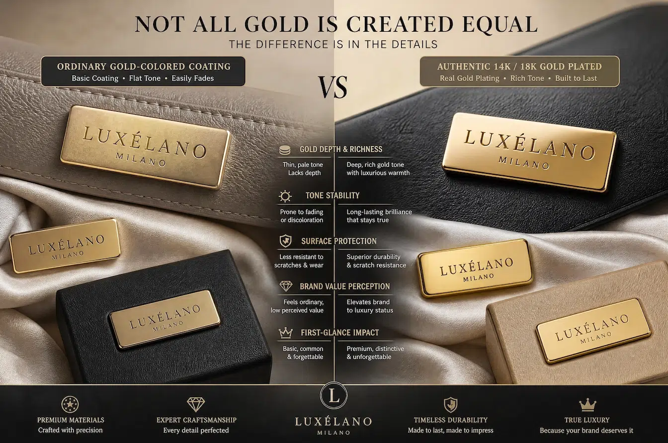
I always separate “gold color” from “real gold plating.” These two ideas are not the same. A gold-colored coating may look attractive in photos, but it may not give the same market feeling as real 14K or 18K gold plating. Real gold plating gives a richer tone and a more honest premium story. When a customer knows that the product uses real gold finish, the label can support a stronger price position.
14K gold and 18K gold also feel different in brand language. 18K gold contains 75% pure gold in the alloy standard, so it is often linked with a richer luxury feeling. 14K gold contains 58.3% pure gold in the alloy standard, so it can feel slightly harder and more practical in some jewelry and hardware uses. In metal label production, the final result still depends on the plating process, underlayer, thickness, surface polishing, and anti-oxidation protection.
| Gold Finish | Brand Feeling | Practical Note |
|---|---|---|
| 18K gold plating | Rich, luxury, warm, high-end | Needs stable color control and protection |
| 14K gold plating | Refined, practical, slightly lighter tone | Good for premium but more restrained designs |
| Light gold | Soft and modern | Color standard must be confirmed clearly |
| Champagne gold | Elegant and quiet | Works well for fashion and lifestyle brands |
| Rose gold | Warm and feminine | Needs careful tone control |
| Antique gold | Vintage and collectible | Aging effect must stay consistent |
| Imitation gold color | Cost-friendly visual option | May not carry the same luxury value |
I also pay attention to protection. A real gold plated label still needs a stable process. The plating should cover the surface evenly. The protection layer should reduce oxidation and rubbing problems. If the gold finish changes too quickly, the customer may doubt the whole product. So I do not see gold plating as only a color choice. I see it as a trust decision.
How Should I Choose the Right Base Metal Before Adding the Gold Finish?
A luxury finish needs a good base. If the base metal is wrong, the gold surface cannot save the final product.
The right base metal should match the label shape, logo detail, product use, weight requirement, and finish target. Brass is strong for premium detail, stainless steel is durable, and zinc alloy supports flexible shapes at controlled cost.
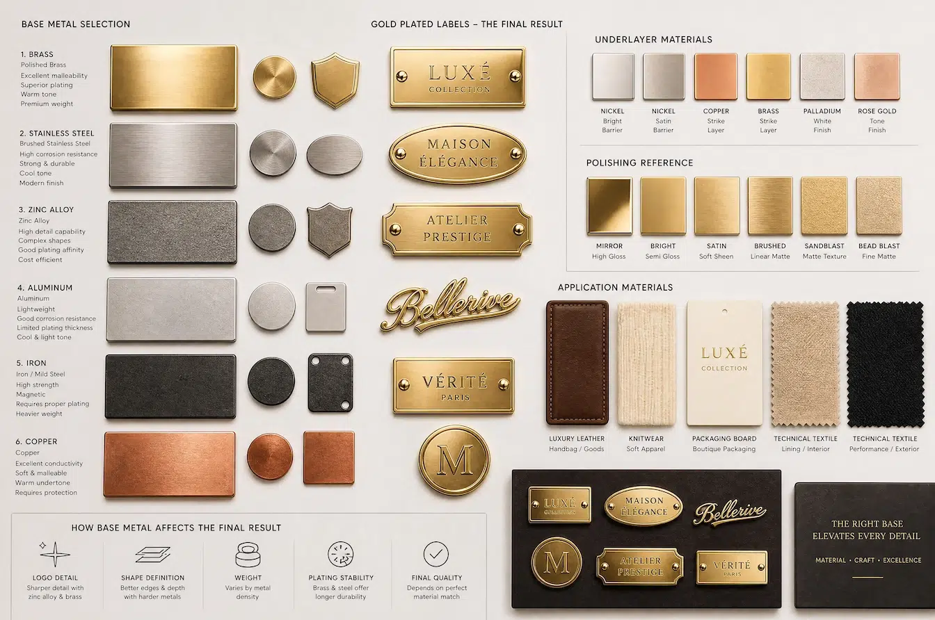
I usually start a custom gold label project by asking what the label must do. A label on a handbag may need strength and a polished luxury look. A label on knitwear may need lower weight and smooth edges. A label on a gift box may need strong visual impact, but it may not face heavy wear. These different uses require different base metals.
Brass is one of my preferred choices for premium labels. It can show fine detail, and it works well with gold plating. It has a solid feel, which supports luxury positioning. Stainless steel is stronger in corrosion resistance. It can work well for modern products, outdoor-related items, or designs that need a clean and technical look. Zinc alloy can create more complex shapes with good cost control. It is useful for decorative labels and larger logo plates. Aluminum can be useful when weight must stay low, but the surface protection must be planned carefully.
| Base Metal | Main Advantage | Best Use | Key Risk |
|---|---|---|---|
| Brass | Fine detail, premium weight, strong plating compatibility | Luxury labels, logo plates, fashion hardware | Higher cost and heavier weight |
| Stainless steel | Strong, clean, corrosion-resistant | Minimal labels, technical products, humid use cases | Harder to process for very fine details |
| Zinc alloy | Flexible shape and cost control | Decorative labels, complex shapes, larger parts | Weight and surface quality need control |
| Aluminum | Lightweight and clean | Thin fabric, light packaging, soft products | Surface may need stronger protection |
| Iron | Lower cost | Basic labels or hidden structure parts | Corrosion risk is higher |
| Copper | Rich base tone and good workability | Special design effects | Needs surface protection |
I also check the product environment. Will the label touch skin? Will it rub against fabric? Will it meet moisture, perfume, sweat, or cleaning chemicals? A real gold finish is valuable, but the base metal and underlayer decide how stable the final label can be. This is why material choice should happen before color choice.
How Does the Finish Communicate Luxury Through Shine, Texture, Color, and Touch?
A gold label does not only show a logo. It also tells a visual story through light, texture, and hand feel.
The finish communicates luxury by controlling how the label reflects light, feels under the finger, and matches the product mood. Polished gold feels bold, matte gold feels quiet, and antique brass feels vintage and collectible.
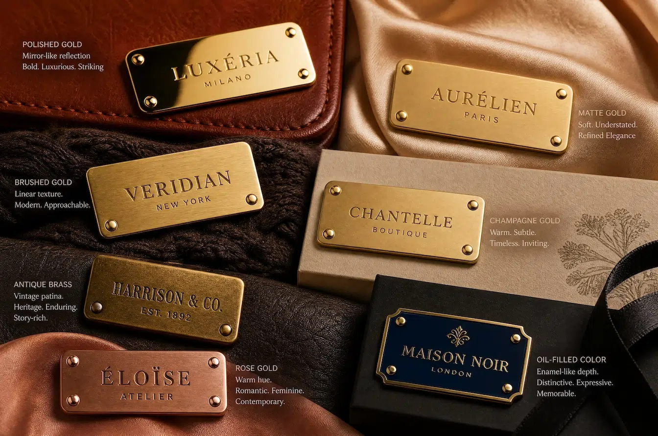
I treat finish selection as a form of brand storytelling. A polished gold label feels direct, bright, and expensive. It works well when the product needs strong shelf impact. A matte gold label feels more modern and quiet. It does not shout, but it can still feel premium. A brushed finish adds direction and texture. It often works well for minimalist or architectural brands. Antique brass gives a vintage feeling. It can suit leather goods, handmade products, heritage apparel, and collectible packaging.
Color must also be controlled carefully. One gold tone can feel young and fresh. Another gold tone can feel mature and classic. A small difference in warmth can change the product mood. This is why I prefer approved physical samples over screen images. A phone screen cannot show the real texture, shine, or gold depth.
| Finish Type | Visual Message | Good For | Production Concern |
|---|---|---|---|
| Polished gold | Bright, bold, luxury | Handbags, outerwear, gift boxes | Scratches and fingerprints may show |
| Matte gold | Quiet, modern, refined | Apparel, knitwear, premium packaging | Color tone must stay even |
| Brushed gold | Structured, clean, design-driven | Minimal brands, lifestyle products | Brush direction must be consistent |
| Champagne gold | Soft, elegant, premium | Women’s fashion, accessories | Tone must be confirmed by sample |
| Antique brass | Vintage, warm, collectible | Leather goods, craft products | Aging effect must be controlled |
| Rose gold | Warm, soft, emotional | Beauty, fashion, gift items | Color can shift if process is unstable |
| Oil-filled color | Strong contrast and logo focus | Brand labels, limited gifts | Filling edges must stay clean |
I also look at touch. A luxury label should not feel rough. The surface should feel smooth unless the design needs texture. The edges should not scratch the product. The back structure should not damage the fabric. A label can look beautiful on the front, but if the back is poorly designed, it can fail in real use. Luxury should exist on both sides of the label.
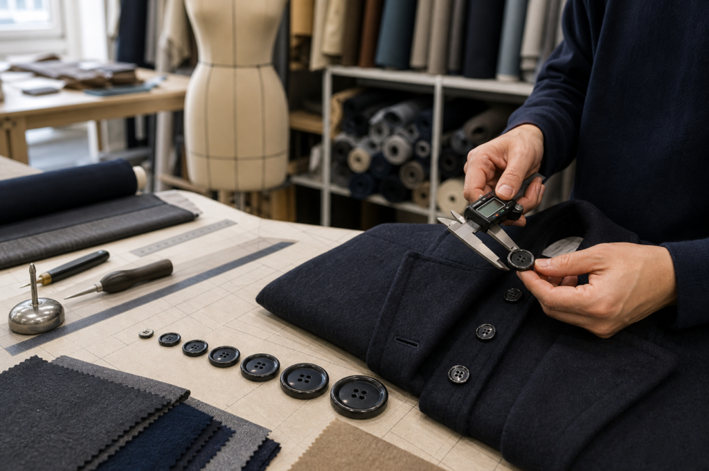
Which Logo Details Matter Most in Engraving, Embossing, Debossing, and Edge Definition?
A logo label succeeds or fails in the details. Small errors can make a premium mark look careless.
Logo details matter because engraving depth, raised height, recessed areas, line sharpness, spacing, and edge definition decide whether the metal label looks precise, tactile, and true to the brand design.
![]()
I always ask for clean vector artwork before custom label development. AI, PDF, SVG, or other vector files help preserve the real shape of the logo. A low-resolution image can create unclear edges, wrong curves, and poor spacing. This becomes a bigger problem when the logo is small. Metal labels have physical limits. Very thin lines, tiny letters, and narrow gaps may not reproduce well after molding, engraving, polishing, and plating.
Different logo methods create different feelings. Laser engraving feels precise and clean. It is good for modern brands and fine information. Embossing creates raised details. It gives a strong touch effect. Debossing creates recessed areas. It can feel quiet and premium. Oil filling adds color contrast. It works well when the brand needs visibility. Cut-out logos can feel more architectural, but they need enough metal strength.
| Logo Method | Visual Effect | Best Use | Key Limitation |
|---|---|---|---|
| Laser engraving | Fine, sharp, precise | Small text, clean logos, serial codes | Contrast depends on surface |
| Embossing | Raised, tactile, strong | Bold brand marks, luxury labels | Tiny details may lose sharpness |
| Debossing | Recessed, subtle, premium | Quiet luxury, leather goods, packaging | Depth must be controlled |
| Oil filling | Color contrast, clear logo | Gift labels, brand plates, limited items | Filling must stay clean and even |
| Cut-out logo | Open, architectural, special | Statement labels, modern brands | Thin lines may become weak |
| Etching | Detailed and flat | Fine patterns and decorative marks | Depth and contrast need testing |
Edge definition is also important. A metal label with rough edges will not feel premium, even if the front logo looks good. I check the outer border, corner radius, hole position, back structure, and polishing result. I also check the installation method. Foldable legs, prongs, screws, adhesive backing, sewing holes, and safety pins all create different use cases. The right method depends on fabric thickness, product category, and whether the label needs to be removable.
How Can I Build Consistency from Sample Approval to Bulk Production?
A perfect sample is not enough. The real challenge is making every bulk label match the approved standard.
Consistency is built by clear artwork, approved physical samples, fixed plating standards, tolerance control, installation testing, and bulk inspection. These steps reduce the risk of color shift, logo distortion, rough edges, and sample-to-bulk mismatch.
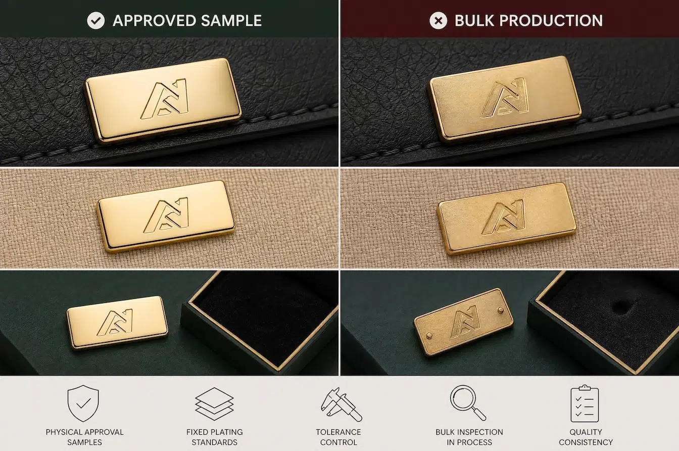
I have seen one common pain point many product teams worry about. The sample looks good, but the bulk order looks different. This can happen with color, shine, logo depth, edge polishing, plating coverage, or back structure. It often happens when the approval standard is not clear enough. A photo approval is not always enough. A physical sample gives a better reference for color, weight, touch, and texture.
A good custom label process should start with artwork review. Vector files help keep the design accurate. Then material and size should be confirmed. After that, the 3D or mold direction can be prepared. The sample should be checked not only for appearance, but also for installation and use. If the label will be used on thick leather, the leg length must match. If it will be used on fine fabric, the back side must be smooth. If it will be used on packaging, adhesion or fixing strength must be tested.
| Production Step | What I Confirm | Why It Matters |
|---|---|---|
| Artwork review | Vector file, logo line, text size | Protects design accuracy |
| Material decision | Brass, zinc alloy, stainless steel, aluminum | Matches weight, detail, and cost |
| Structure planning | Back legs, pin, screw, holes, adhesive | Matches final application |
| Sample production | Size, logo, edge, surface, color | Creates physical approval standard |
| Installation test | Fabric, leather, packaging, or product fit | Prevents real use failure |
| Finish approval | Gold tone, shine, texture, protection | Reduces color and surface risk |
| Bulk production | Tolerance, plating, polishing, packing | Protects repeatability |
| Final inspection | Visual, size, function, quantity | Reduces delivery risk |
I also consider timing. A sample cycle may take about 7 to 14 days, depending on design and mold needs. Bulk production may take about 20 to 35 days, depending on quantity, finish, and inspection requirements. For seasonal launches, this timing must be planned early. A custom label may be small, but it can delay the whole product if it is not managed well. This is why I treat metal label production as part of the product development calendar, not as a last-minute purchase.
Conclusion
I see real gold metal labels as small luxury symbols. When material, finish, logo detail, and production control work together, the product gains stronger brand value.